Building Expandable List with OutlineGroup & DisclosureGroup in SwiftUI 2.0
Published at July 22, 2020
Building an expandable list with nested items is quite a complex and error prone task to implement when using UITableView in UIKit. Luckily with SwiftUI 2.0, Apple introduced OutlineGroup and DisclosureGroup. With the views in our arsenal, we can build a hierarchical expandable and collapsible list with minimal lines of code using declarative syntax and reactive state management.
What We Will Build
We’re going to explore about OutlineGroup and DisclosureGroup, and how we can use them in practice to build List that represent hierarchical data in the UI by building three different kind of screens:
- Using List to Render Hierarchical Data.
- Using OutlineGroup in List to handle multiple kind of views.
- Using DisclosureGroup for expandable/collapsible behavior to group of views with state binding.
You can download the completed project Source from the GitHub repository. Completed Project GitHub Repository - Github.com
Using List to Render Hierarchical Data
Let’s move on to the first example, which is showing list of items that have nested items inside of them.
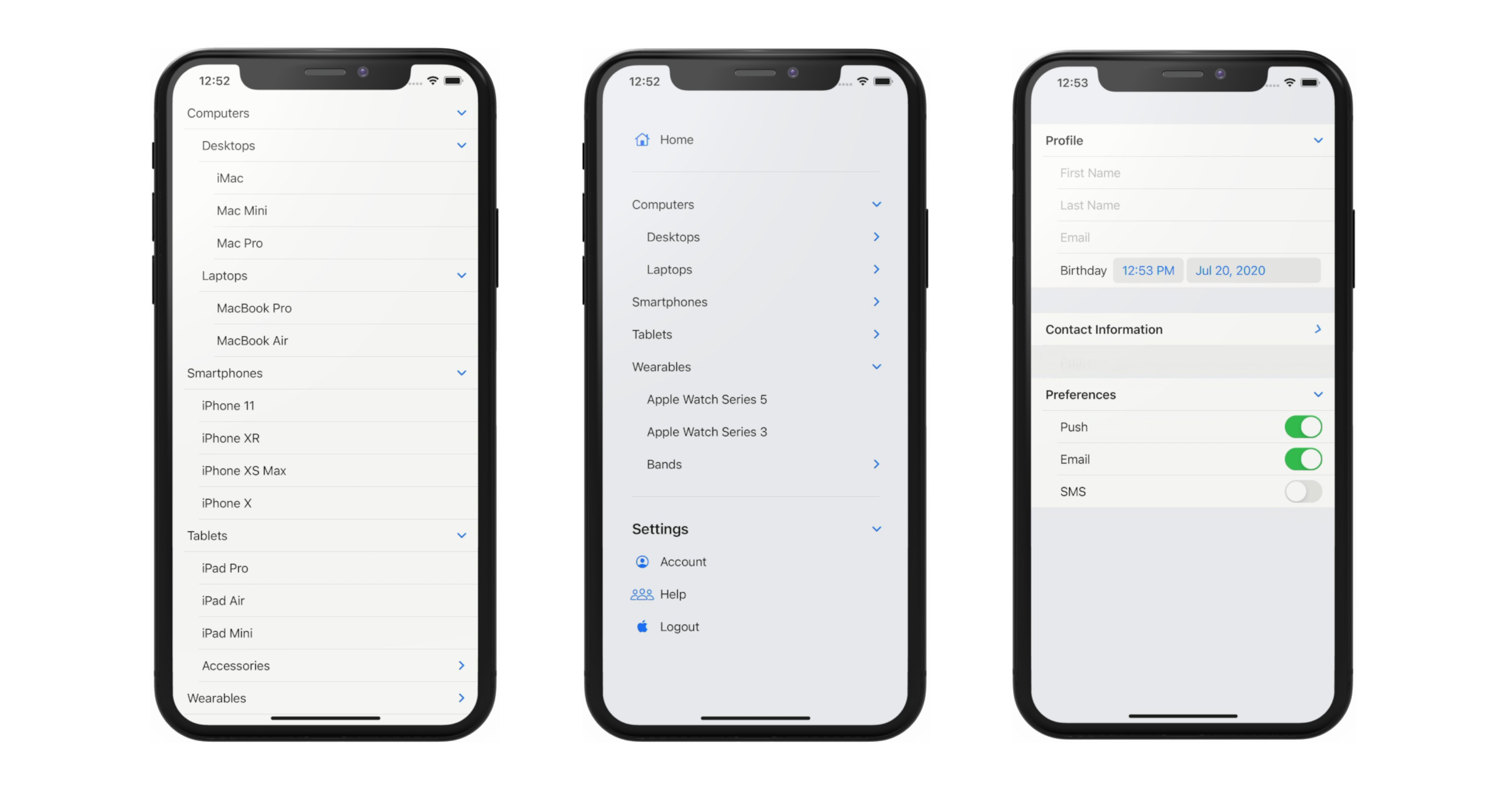
By looking at the screenshoot above, we can see that at the root level, we have items such as Computers, Smartphones, Tablets, and, Wearables.
Inside the Computers, we have desktop and laptops. Inside the desktops, we have the children such as iMac, Mac Mini, Mac Pro. For the children of the Laptops, we have MacBook Pro, MacBook Air, and MacBook Pro. In this case, the depth of the Computers category is 3.
Inside the smartphones, we have the children such as iPhone 11, iPhone XS, iPhone XR, iPhone X, iPhone SE. In this case the depth of the Smartphones category is 2.
Let’s dive into Xcode and learn how SwiftUI can help us to build this UI with very minimal lines of code. Create a new Xcode Project, give it any name that you prefer to.
Create Item Model
struct Item: Identifiable {
    let id = UUID()
    let title: String
    let children: [Item]?
}
First, we'll create a model to represent the item in the list. Create a new file named Item.swift. Declare the Item as a struct that conforms to Identifiable. Let's declare the id property to satisfy the protocol requirement. We'll use UUID as the type of the id as well as assigning it with default value. When we initialize UUID instance using the default initializer, the value will be unique.
Next, let's declare the title property with type of String, we'll use this to render the Text. Continuing on, to represent the children in the model, we need to declare a property containing the Array of the Item as this will be used by SwiftUI to determine whether the current item has children in the hierarchy. Let's declare and named it as children.
Create ItemList UI
struct ItemList: View {

    let items: [Item]

    var body: some View {
        List(items, children: \.children) {
            Text($0.title)
        }
    }
}
Let's move on to build the View. Create a new file named ItemList.swift. Declare an instance property named items which is an array of Item. Inside the body implementation, we just need to initialize List passing the items. To enable the nesting of the children, we need to pass the keypath property name that contains the array of the Item to the children parameter. In our case, we pass the \.children as the keypath. Inside the view builder closure, we just need to render the Item inside the text using the title property.
extension Item {

    static var stubs: [Item] {
        [
            Item(title: "Computers", children: [
                Item(title: "Desktops", children: [
                    Item(title: "iMac", children: nil),
                    Item(title: "Mac Mini", children: nil),
                    Item(title: "Mac Pro", children: nil)
                ]),
                Item(title: "Laptops", children: [
                    Item(title: "MacBook Pro", children: nil),
                    Item(title: "MacBook Air", children: nil),
                ])
            ]),
            Item(title: "Smartphones", children: [
                Item(title: "iPhone 11", children: nil),
                Item(title: "iPhone XR", children: nil),
                Item(title: "iPhone XS Max", children: nil),
                Item(title: "iPhone X", children: nil)
            ]),
            Item(title: "Tablets", children: [
                    Item(title: "iPad Pro", children: nil),
                    Item(title: "iPad Air", children: nil),
                    Item(title: "iPad Mini", children: nil),
                    Item(title: "Accessories", children: [
                        Item(title: "Magic Keyboard", children: nil),
                        Item(title: "Smart Keyboard", children: nil)
                    ])]),
            Item(title: "Wearables", children: [
                Item(title: "Apple Watch Series 5", children: nil),
                Item(title: "Apple Watch Series 3", children: nil),
                Item(title: "Bands", children: [
                    Item(title: "Sport Band", children: nil),
                    Item(title: "Leather Band", children: nil),
                    Item(title: "Milanese Band", children: nil)
                ])
            ])
        ]
    }
}
Before we can preview the UI, we need to inject the Stub data into the preview. At the bottom of the source file, create an extension for the Item to help us stub the model. Declare the static constant stubs with type of Item Array. The first item will be computers, it has 2 children, desktops, and laptops. The desktops has 3 children: iMac, Mac Pro, and Mac Mini. The laptops has 2 children: MacBook Pro and MacBook Air. Let's try this first, we just need to pass this when initializing the ItemList inside the preview like so.
struct ItemList_Previews: PreviewProvider {
    static var previews: some View {
        ItemList(items: Item.stubs)
    }
}
The computers is shown in the preview with a disclosure indicator. To enable interaction in the live preview, make sure to press on the play button. Click on the indicator to make it expands to show the desktops and laptops. Try to also expand the desktops and laptops. As you can see with only 3 lines of UI related code, we're able to show hierarchical nested data inside our SwiftUI list! It works recursively until the item has no more children.
Using OutlineGroup in List to Handle Multiple Kind of Views
You might be thinking, how can we display different kind of views and data in the list. No worries, we can use the new OutlineGroup to handle this scenario. Let's take a look at the second screen we'll build!
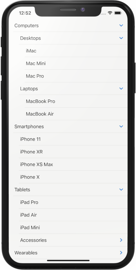
We have a Sidebar List containing menu items. At the top we, have the home menu, then at the middle section, we have the hierarchical items we have created before, finally at the bottom, we have the settings section which is also expandable containing the Account, Help, and Logout menu.
struct SidebarList: View {
    let items: [Item]

    var body: some View {
        List {
            Label("Home", systemImage: "house")

            Divider()

            OutlineGroup(items, children: \.children) {
                Text($0.title)
            }

            Divider()

            Section(header: Text("Settings")) {
                Label("Account", systemImage: "person.crop.circle")
                Label("Help", systemImage: "person.3")
                Label("Logout", systemImage: "applelogo")
            }
        }
        .listStyle(SidebarListStyle())
    }
}

struct SidebarList_Previews: PreviewProvider {
    static var previews: some View {
        SidebarList(items: Item.stubs)
    }
}
Let’s create a new SwiftUI view named SidebarList.swift. Declare an instance property named items which is an array of Item` model. Let’s pass the stub items in the preview class to the initializer and activate the live preview.
In the body implementation, declare an empty List, also add a ListStyle modifier passing the newly available SidebarListStyle. This style is suitable for sidebar list of menus especially in iPad.
At the top of view builder closure, declare a Label passing Home as the title and house as the systemImage. Label is a new view in SwiftUI 2.0 that renders a text as the leading item and a SF Symbol image as the trailing item.
To render our hierarchical items, we can use the OutlineGroup passing the array of items and keypath of the children property containing the array of the items. In the view builder closure, we can just render a text using the title of the item. Using the live preview, try to expand and collapse the items from the live preview to make sure it works.
Let’s move to the bottom section. By using SidebarListStyle as the ListStyle, we can use the Section View, this will add the expand and collapse behavior automatically for the views inside.
Let’s implement this, declare a Section, then pass the Text with Setting string as the Header. In the view builder, declare the 3 labels for account, help, and logout. Finally, add the Divider between each section.
Run the live preview, the settings section now provides the disclosure indicator where we can use it to expand or collapse the section. Awesome!
Using DisclosureGroup for Expandable/Collapsible Behavior to Group of Views with State Binding
Last, i want to show you the DisclosureGroup view which we can use to add expand and collapse behavior for a group of views within the same hierarchy. Let's take a look at the screenshoot below.
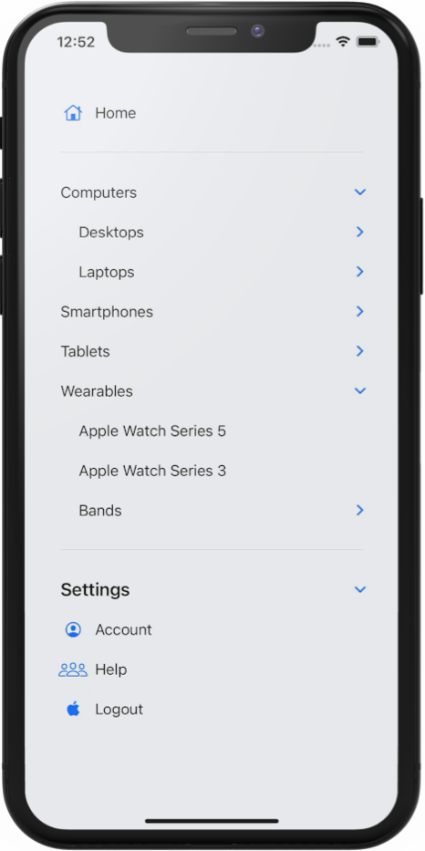
At the top of the Form, we have the personal information section containing textfields for names and email. Then, we have a datepicker for birthday. The section within the form can be collapsed and expanded, and the default state for the personal info section is expanded.
In the next section, we have a preferences notification section. It has three toggles where user can opt-in to receive notifications via email, sms, and push notification. The default state for the section is collapsed.
Let’s go back to Xcode and implement the form using DisclosureGroup. Create a new SwiftUI file named FormList.swift.
struct FormList: View {

    @State var isProfileExpanded = true
    var body: some View {
        Form {
            Section {
                DisclosureGroup(isExpanded: $isProfileExpanded) {
                    TextField("First Name", text: .constant(""))
                    TextField("Last Name", text: .constant(""))
                    TextField("Email", text: .constant(""))
                    DatePicker("Birthday", selection: .constant(Date()))
                } label: {
                    Text("Profile")
                        .font(.headline)
                }
            }

            Section {
                DisclosureGroup {
                    Toggle("Push", isOn: .constant(true))
                    Toggle("Email", isOn: .constant(true))
                    Toggle("SMS", isOn: .constant(false))
                } label: {
                    Text("Preferences")
                        .font(.headline)
                }
            }
        }
    }
}

struct FormList_Previews: PreviewProvider {
    static var previews: some View {
        FormList()
    }
}
In the body implementation, declare Form as the root view. Inside the view builder, declare a DisclosureGroup. Inside view builder, the Let’s declare the texfields and DatePicker. For the simplicity of this example, i just passed an inline constant as the binding instead of passing state properties. Let’s set the label parameter with Text passing Personal Information string. This syntax is part of the multiple trailing closure feature of Swift 5.3.
Let’s see the result in the live preview by clicking on the disclosure indicator to expand and collapse the section.
Next, let’s declare the notification preferences section. Declare a DisclosureGroup. Inside the view builder, declare the three toggles. For the label, just pass the Text containing the notification preferences setting.
To control the expand and collapse state of a DisclosureGroup manually, we can pass a binding containing a boolean. Let’s declare a state property isProfileSectionExpanded and assign true as the default value. On the Profile DisclosureGroup, we can pass the binding of the state to the isExpanded parameter.
Let’s rebuild the app and run the live preview. As we can see, the profile section has an expanded state as the default behavior.
Conclusion
That’s it for this quick and practical example of how we can build a List with hierarchical data using OutlineGroup and Disclosure Group.
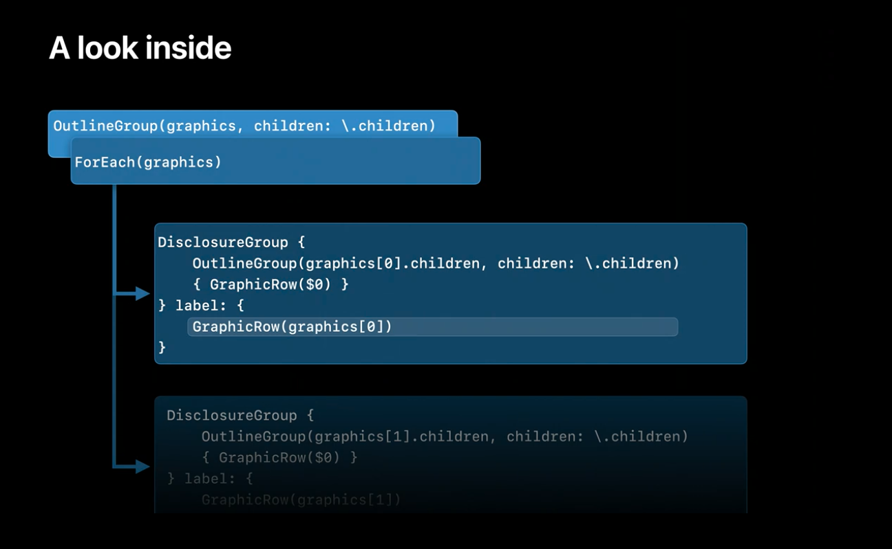
You can watch the related WWDC 2020 session to learn more about how the view work. You will be amazed that in at implementation level, Apple basically used DisclosureGroup and OutlineGroup recursively to enable the nesting for List and OutlineGroup! Apple WWDC 2020 Session - Stacks, Grids, and Outlines in SwiftUI
Until the next one, lets keep the lifelong learning goes on!